Choosing what to wear to a photoshoot can feel like standing in front of a wardrobe that suddenly forgot how to cooperate. The good news? It doesn’t have to be complicated. The right colors can quietly elevate your photos, while the wrong ones can steal attention from what really matters: you.
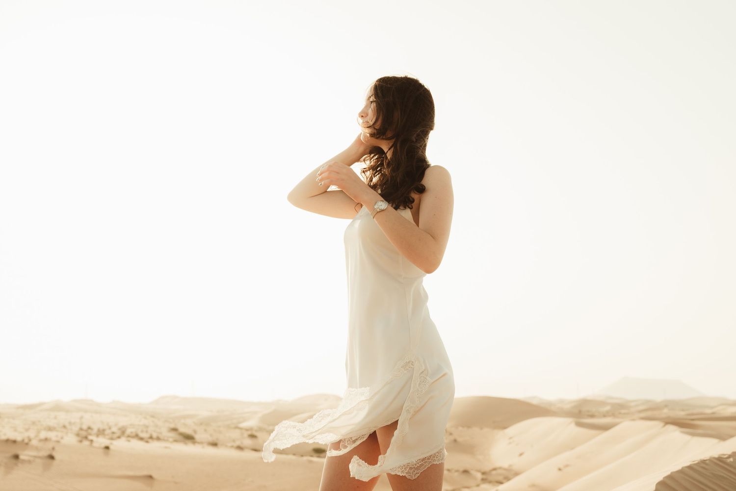
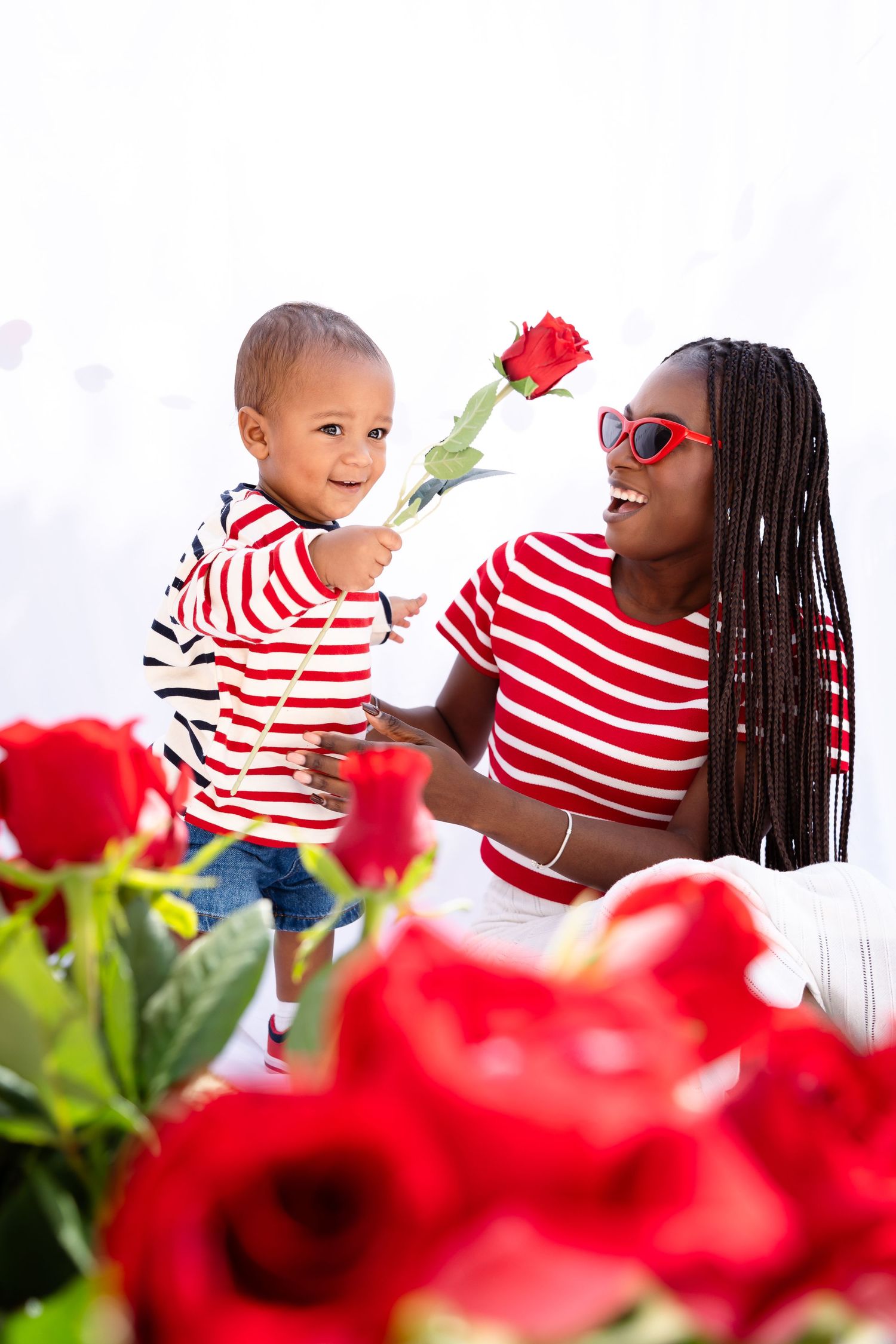
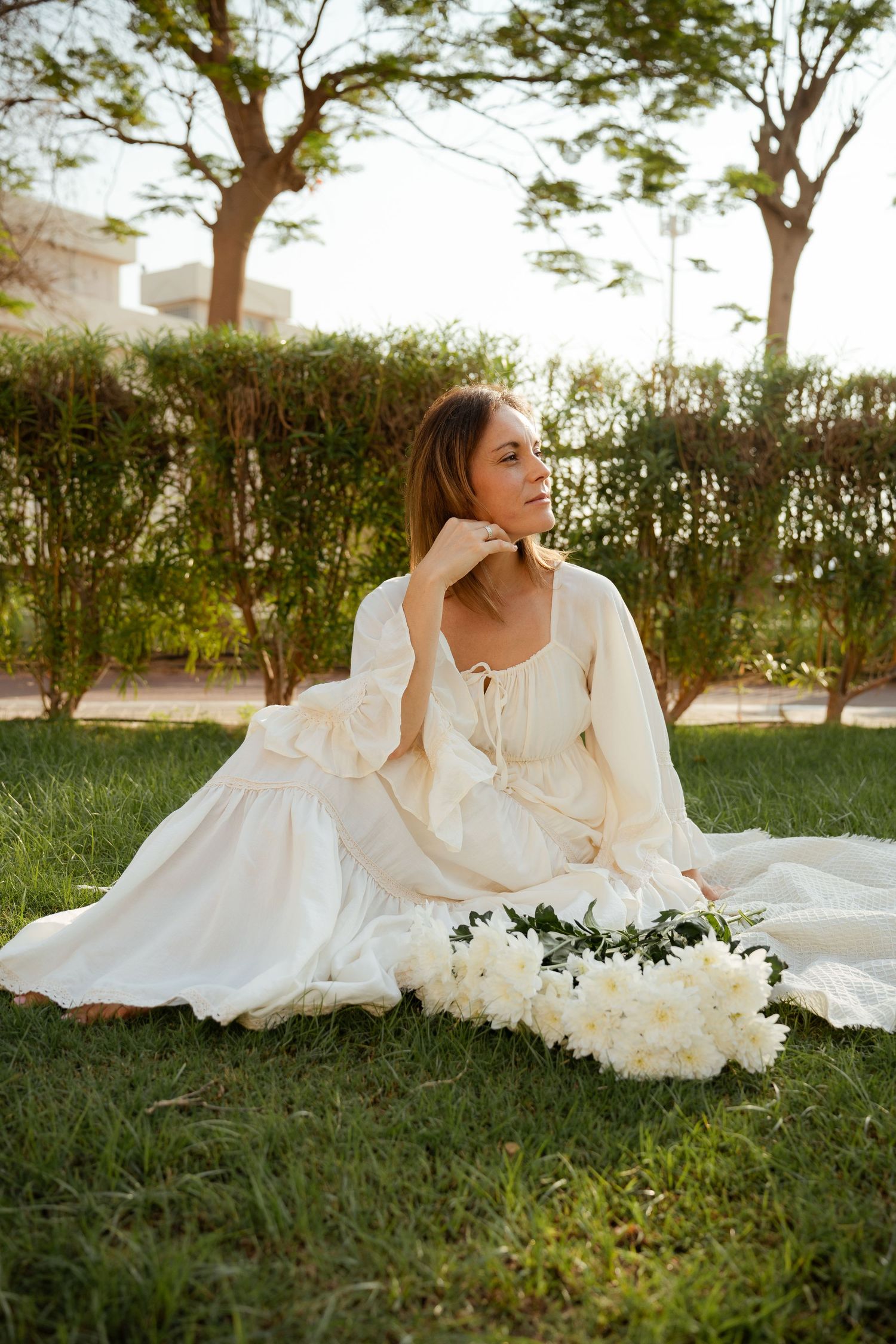
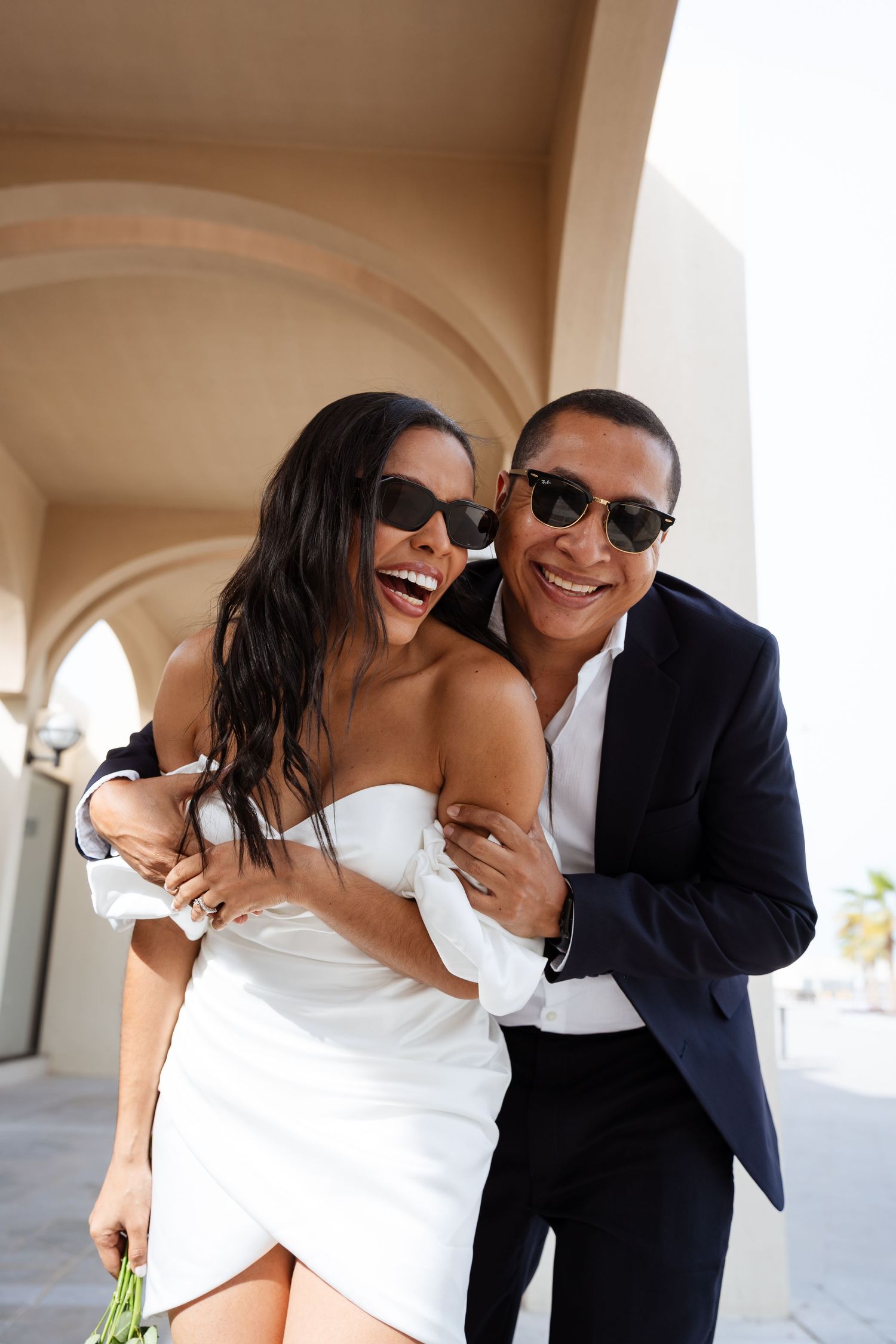
When it comes to couples or personal shoots, this is your moment to lean into a bit more personality. Rich, bold tones photograph beautifully and can add depth and emotion to your images. Think deep reds, emerald greens, burnt orange, navy blues. These colors don’t just sit in the frame, they bring a certain presence. If you’ve been waiting for a reason to wear that statement dress or that shirt you love but rarely reach for, this is it. As long as the colors complement your skin tone and don’t clash harshly with the location, you have room to play.
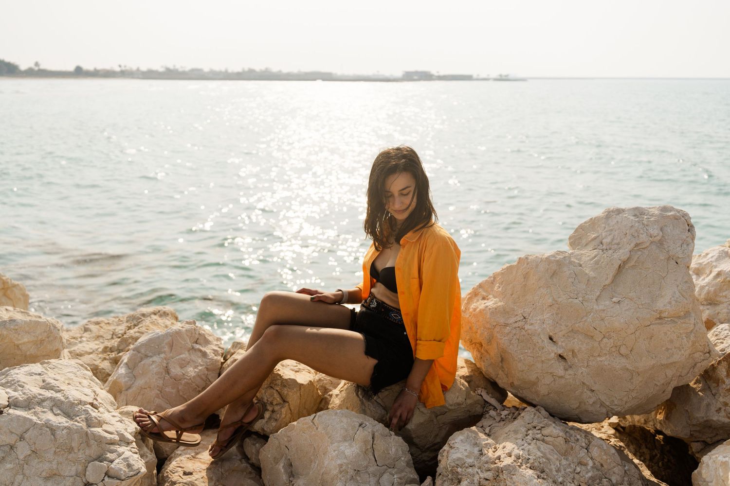
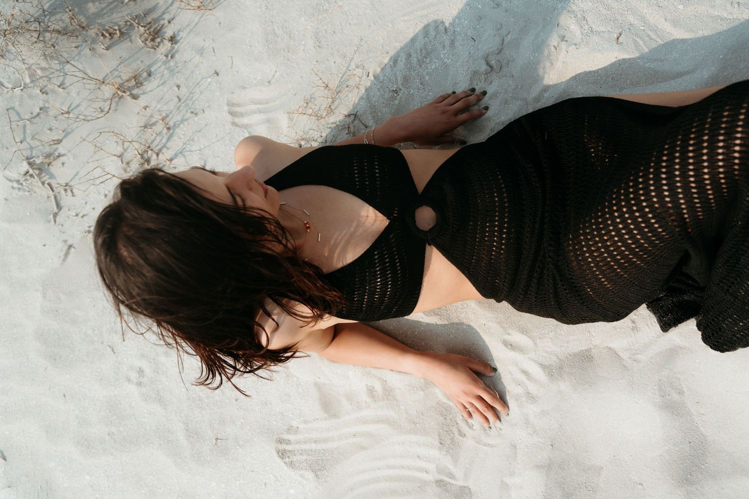
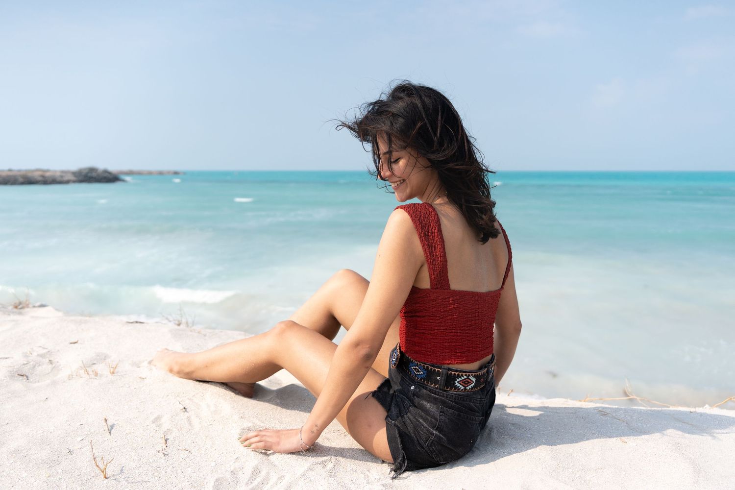
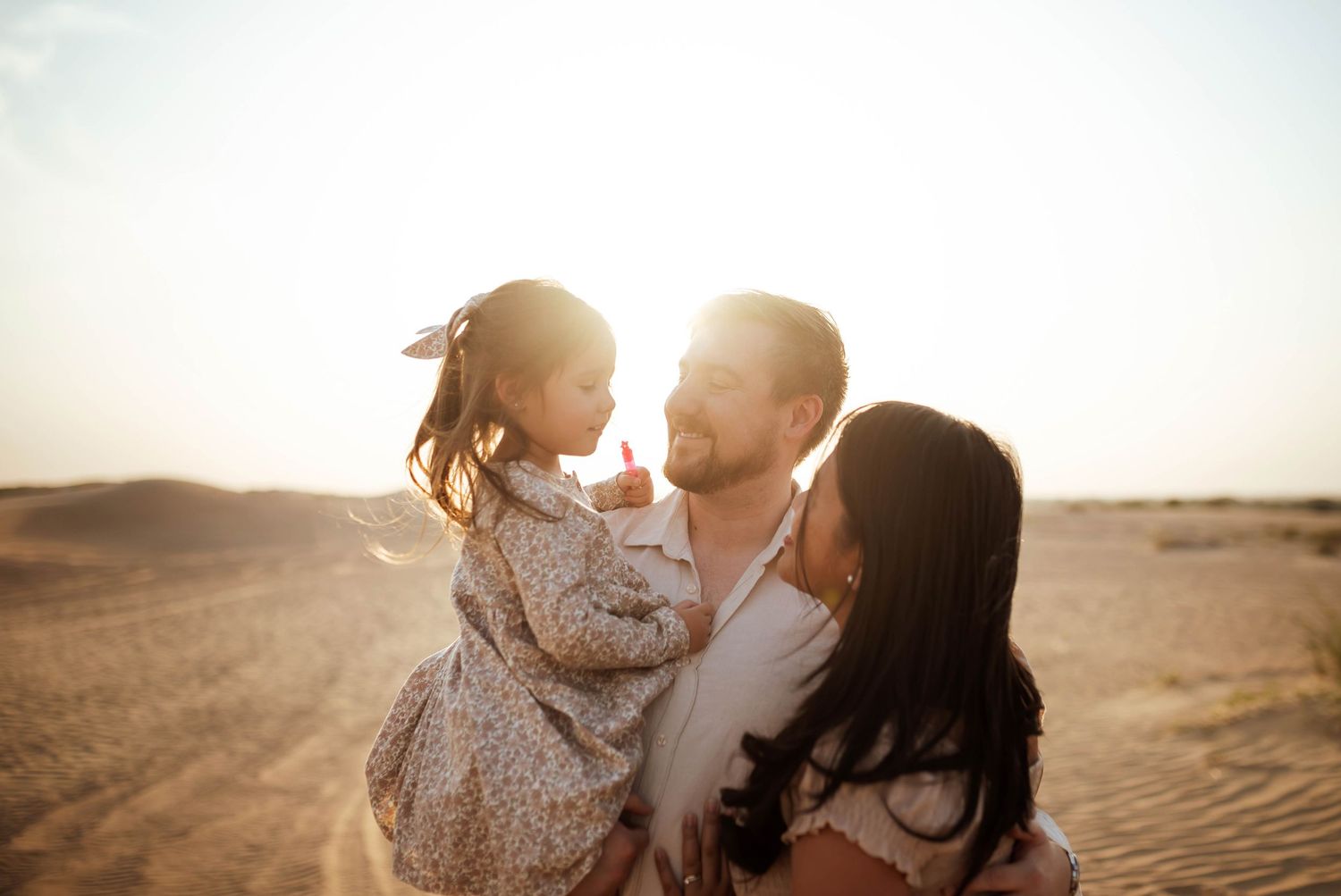
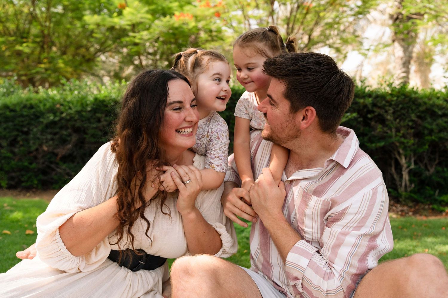
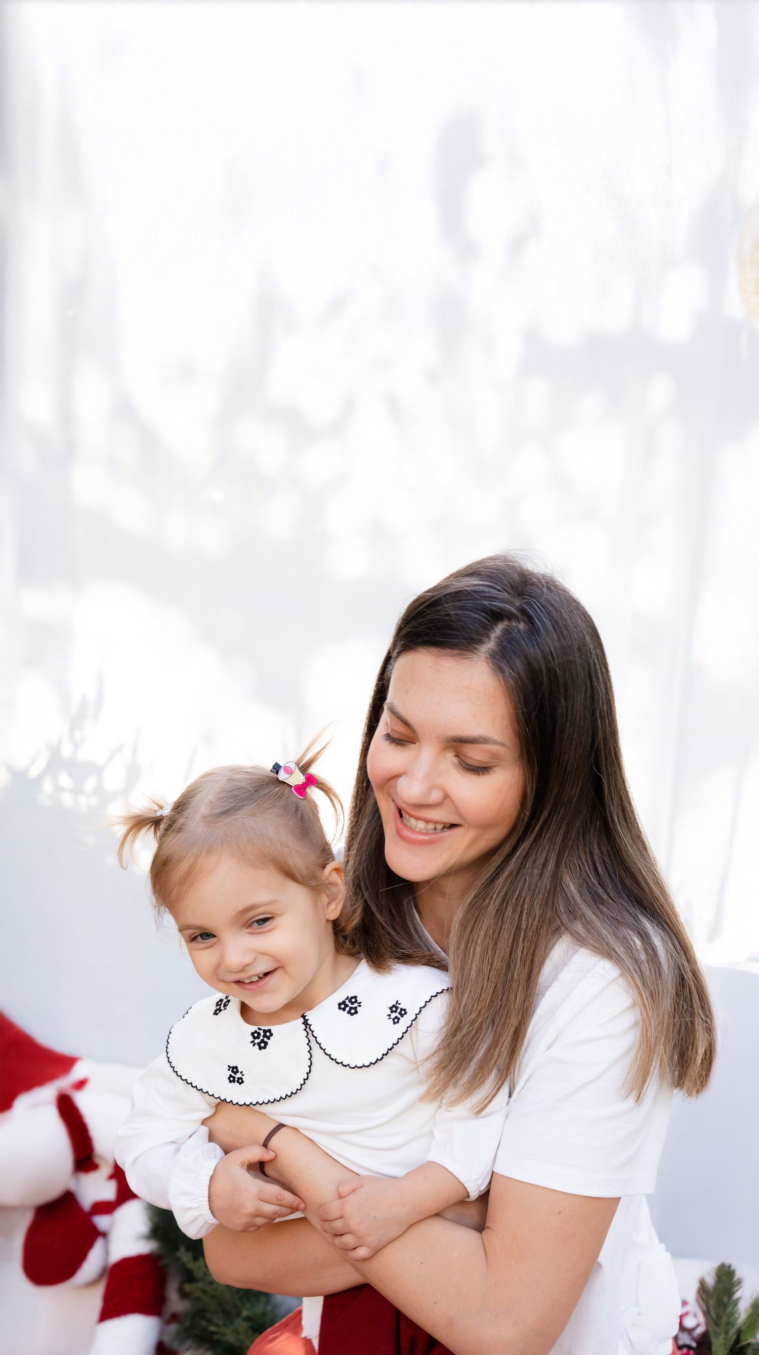
Family sessions, on the other hand, work a little differently. Here, the goal is harmony. When multiple people are in the frame, bold colors can quickly start competing with each other, pulling attention in too many directions. Softer, more muted tones tend to work best because they keep the focus where it belongs, on your faces, your connection, and those in-between moments.
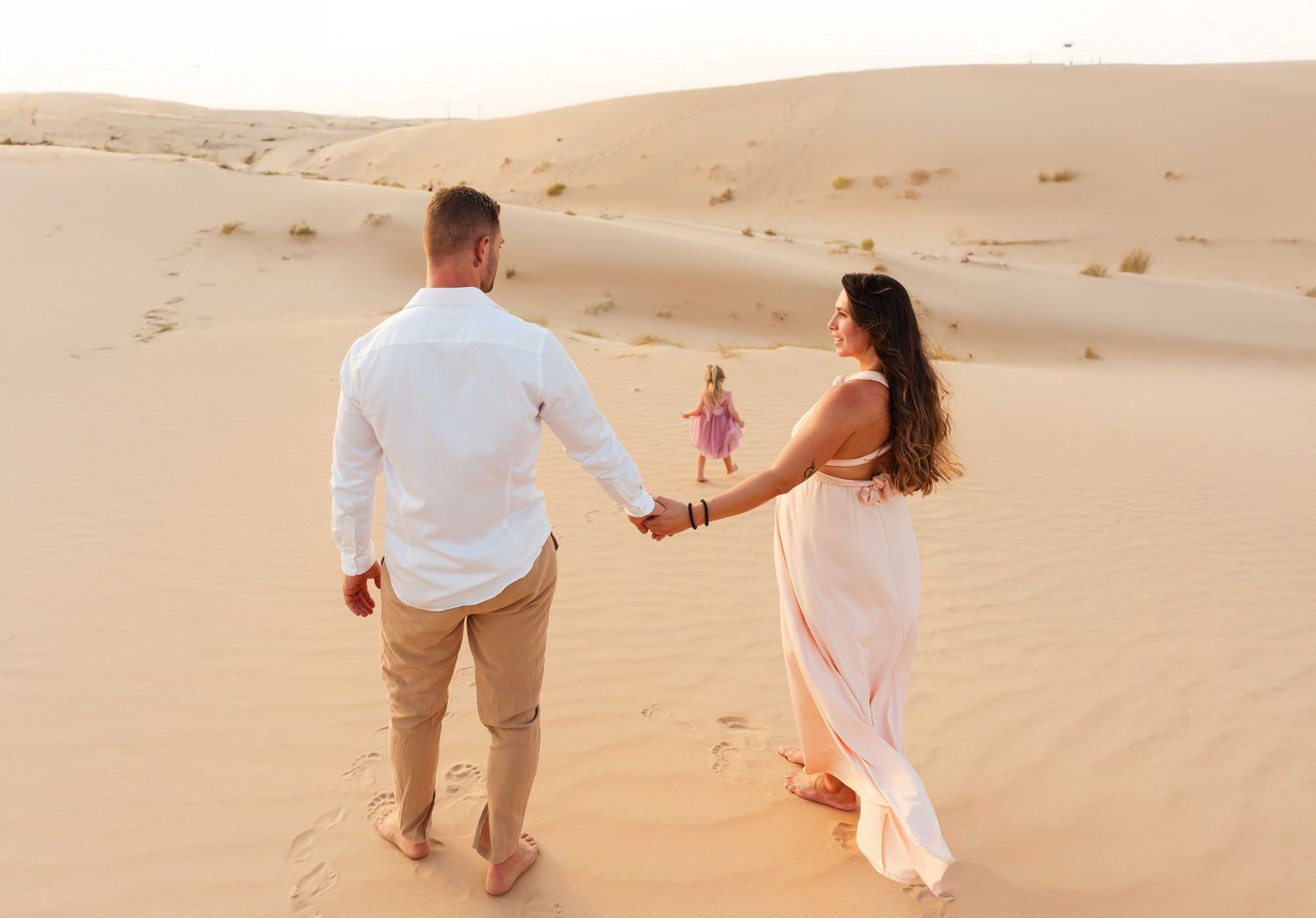
Neutrals and earthy tones are always a safe and beautiful choice. Think creams, beiges, soft browns, warm whites, dusty blues, sage greens. These colors blend effortlessly together and create a timeless feel. They also photograph consistently well in natural light, especially in locations like the desert or the beach.
That doesn’t mean everyone has to wear the exact same shade. In fact, it’s better if you don’t. The magic happens when outfits complement each other rather than match perfectly. You can mix tones within the same color palette, add subtle textures, or layer pieces to create depth without overwhelming the image.
Pro Tip
A little tip
What to avoid
There are a few common wardrobe pitfalls that can distract from an otherwise beautiful session.
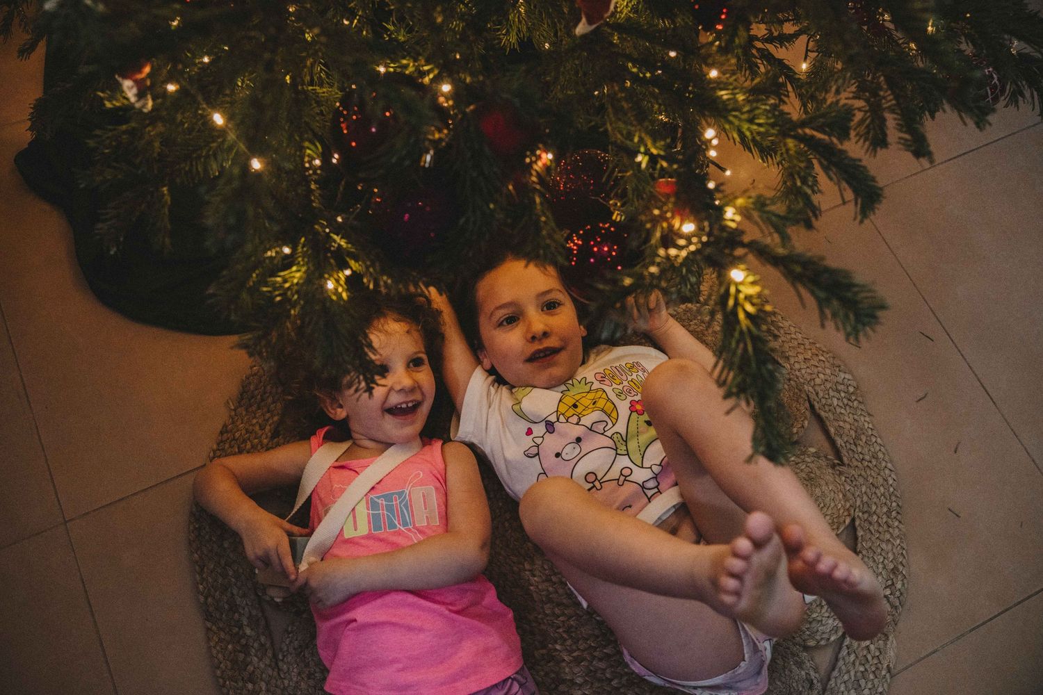
Try to avoid large logos, graphics, or text on clothing. These tend to pull the eye immediately and can date your photos over time. Neon colors are another tricky one, they can reflect onto the skin in unflattering ways and often look harsher in photos than in real life.
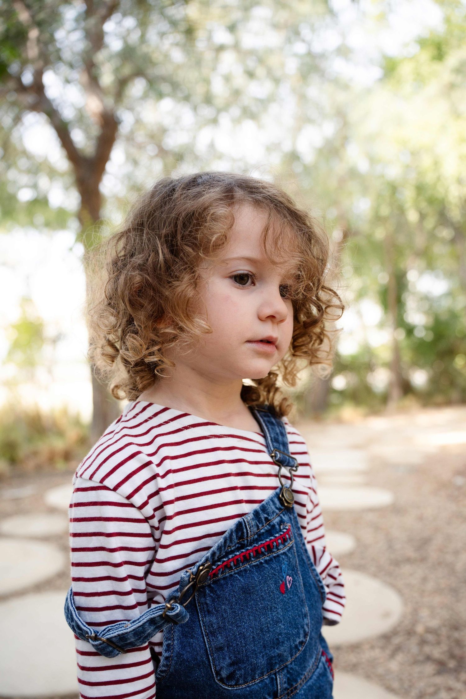
Busy patterns can also be overwhelming, especially in family sessions. When everyone is wearing something different and patterned, the image can start to feel chaotic. If you love patterns, keep them subtle and let only one person wear them while the others stay more neutral.
Matching outfits exactly can feel a bit stiff and outdated. Instead of everyone in the same white shirt and jeans, aim for coordination with variation. It creates a much more natural and relaxed look.
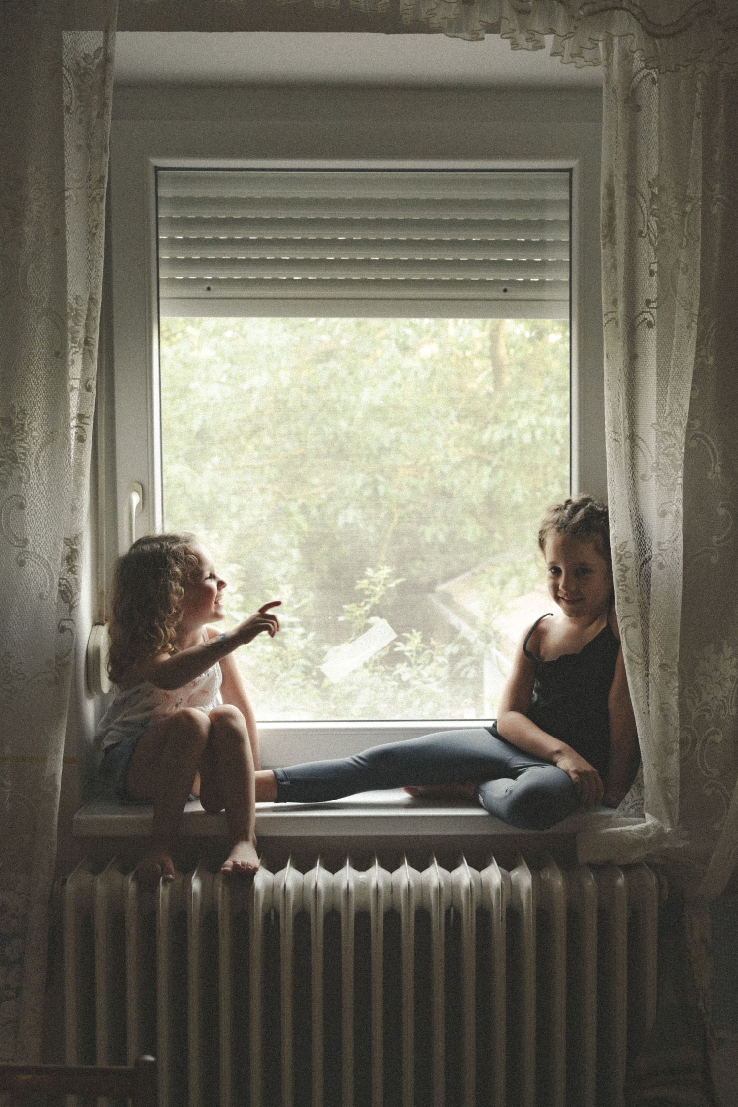
Lastly, try to avoid clothing that you feel uncomfortable in. If you’re constantly adjusting straps, pulling at fabric, or worrying about how something sits, it will show. Comfort has a quiet way of turning into confidence, and that’s what really brings photos to life.
At the end of the day, the most important thing is that you feel comfortable and like yourself. Because when you do, it shows. And that’s always more powerful than any color palette.
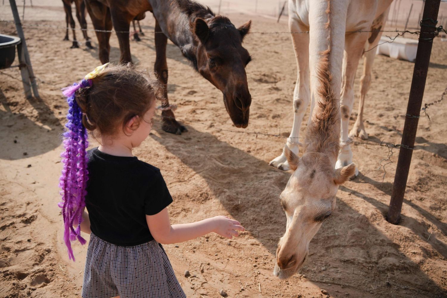
P.S. the children shown in the below three photos of what not to wear are my own ha ha.. Don't be like my children!
A simple way to think about it is this:
For couples or solo shoots:
Your outfit can be part of the story.
For family shoots:
Your outfit should support the story, not compete with it.
Choosing the Right Patterns for Your Photoshoot
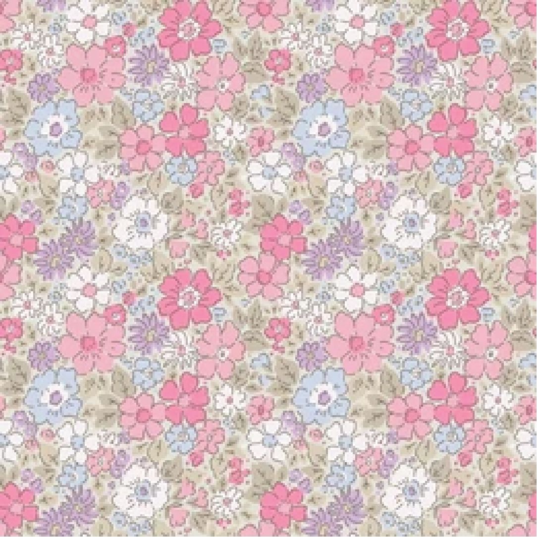
Good Pattern choice
This delicate, small-scale pattern in soft pastel tones is wonderfully versatile and easy to pair with other fabrics and prints. Its gentle palette makes it a lovely choice for little girls or babies, adding a subtle, sweet charm without overwhelming the overall look.
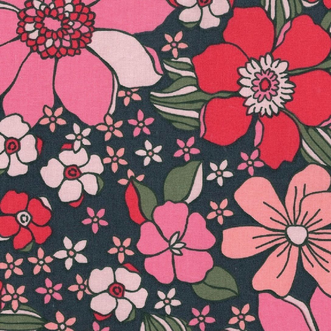
Unfavorable
Pattern choice
This floral pattern leans a little too bold for photos. The large, colorful blooms tend to pull attention away from your face and can feel visually busy in images. It’s also trickier to pair with other patterns or fabrics, as the scale and contrast can easily clash rather than complement.
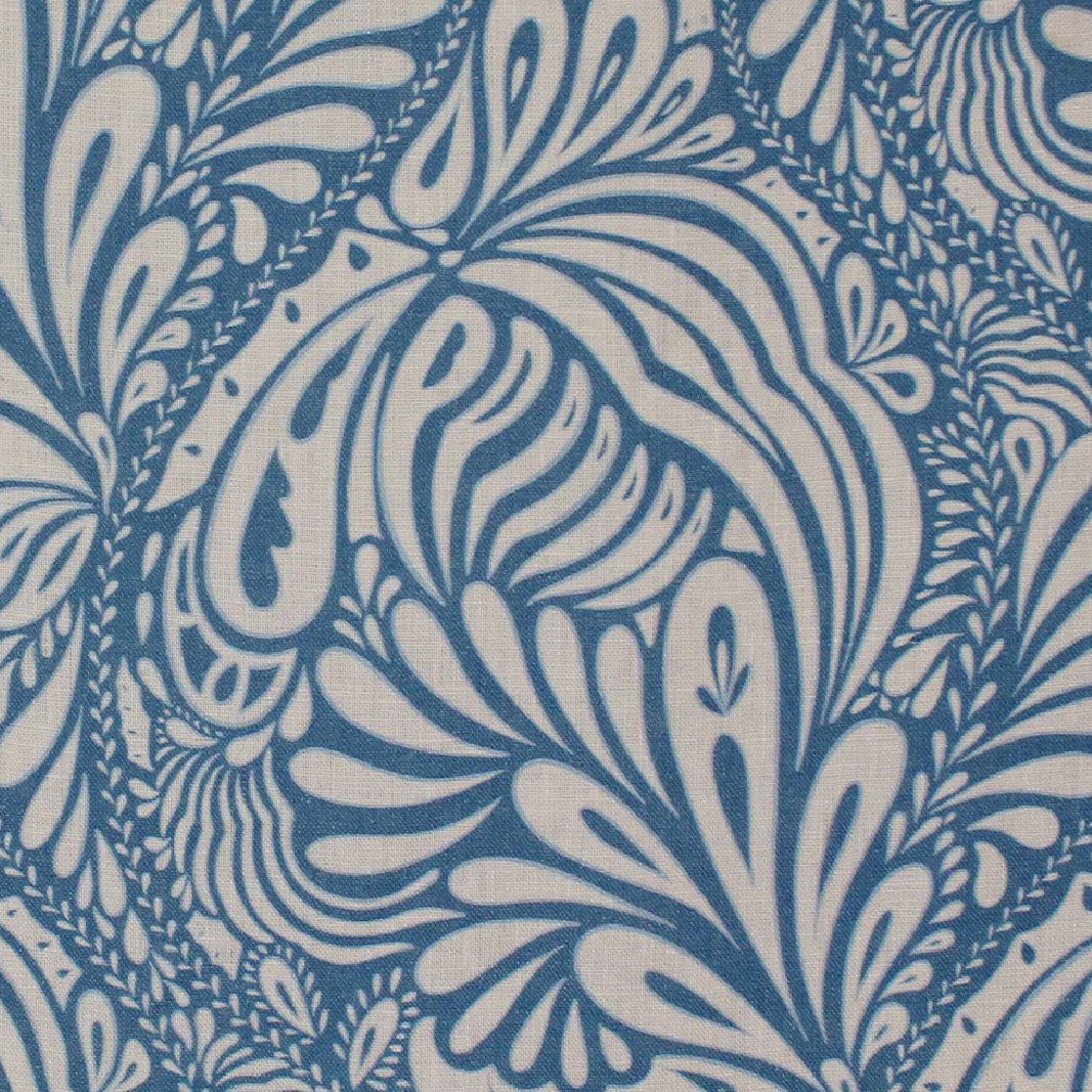
Good Pattern choice
This monochrome pattern strikes a lovely balance. It’s soft and subtle enough not to steal the spotlight from the subjects, while still adding a touch of texture and interest. It pairs effortlessly with white or blue outfits, making styling feel simple and cohesive.
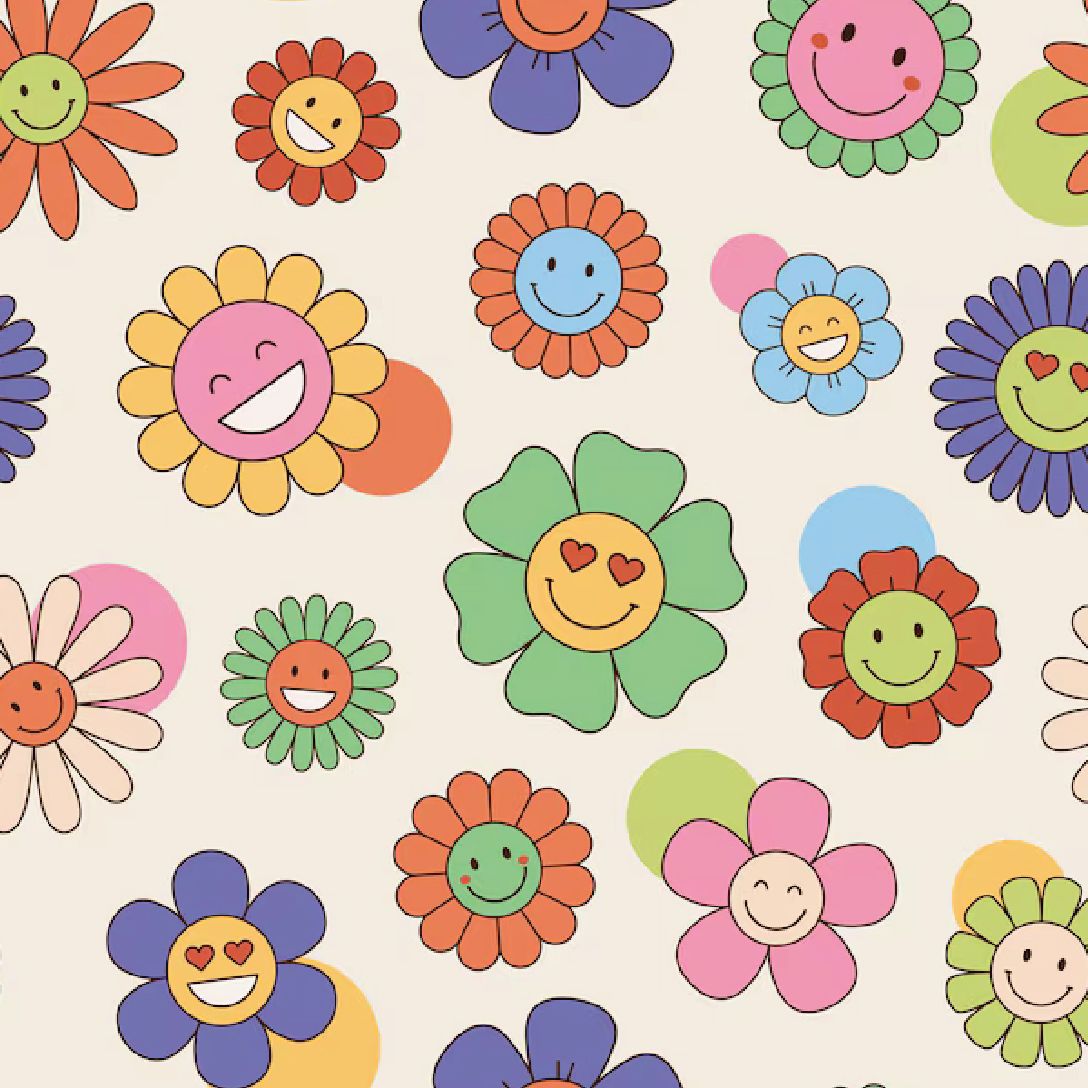
Unfavorable Pattern choice
It’s generally best to avoid outfits with faces printed on them for a photoshoot. Our eyes are naturally drawn to faces, so these prints can quickly become a distraction and pull attention away from the actual subjects in the images. Keeping clothing simple helps ensure the focus stays where it belongs.
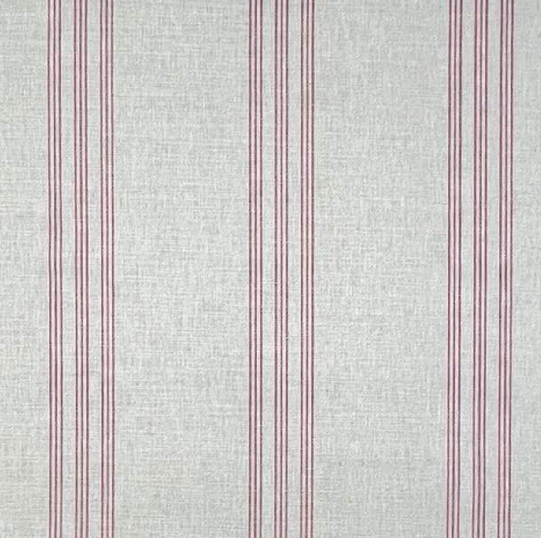
Good Pattern choice
Simple patterns are always a great choice, especially subtle ones like vertical lines. They add a touch of interest without overwhelming the image. Sticking to minimal, natural colors keeps everything feeling calm, timeless, and effortlessly cohesive.
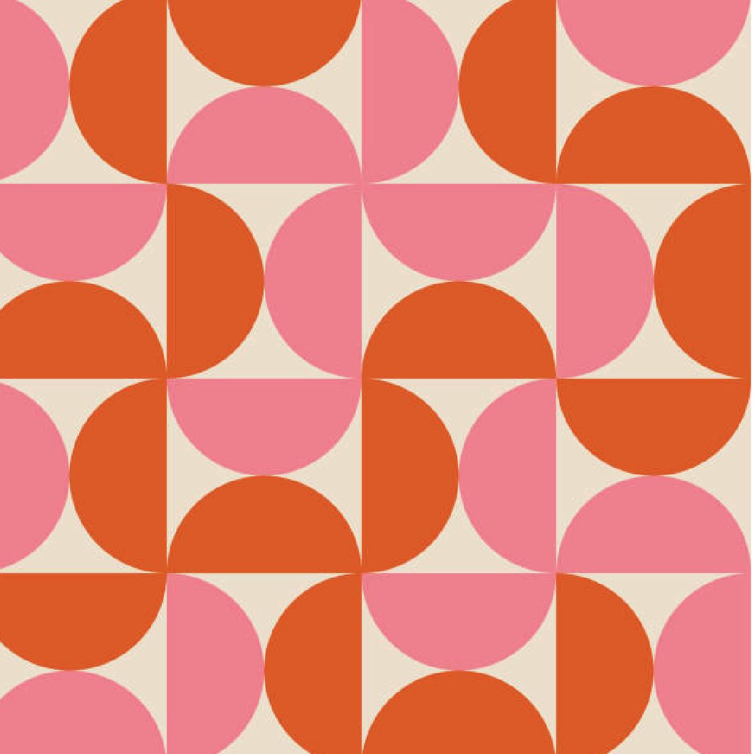
Unfavorable
Pattern choice
Mid-century modern geometric patterns tend to be bold and vibrant, which can make them tricky for photoshoots. In group settings especially, they often feel too busy and distracting, pulling attention away from the people in the frame. The strong colors can also cast unwanted tones onto the skin, which isn’t always flattering.
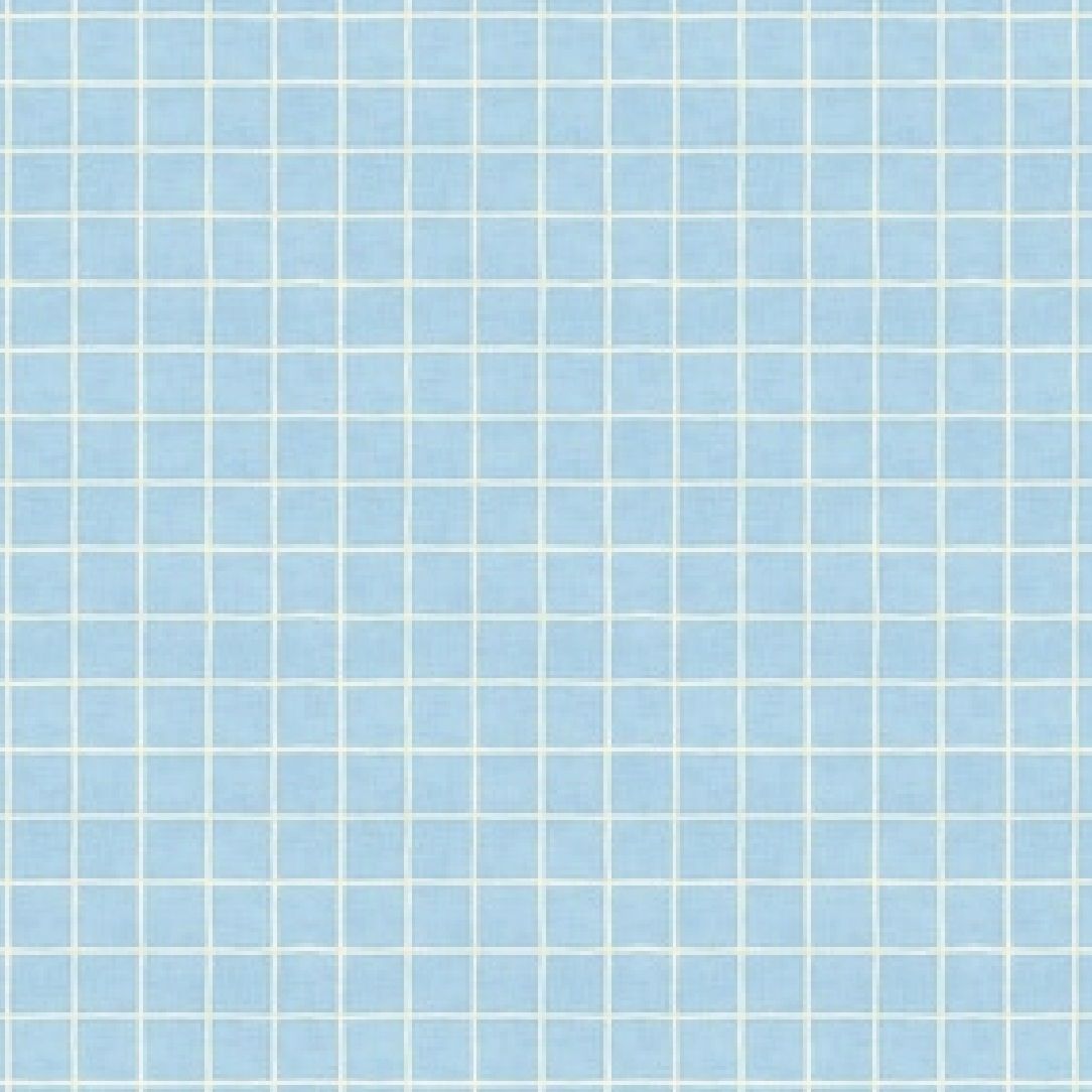
Good Pattern choice
Small grid patterns are a lovely way to add a bit of texture without drawing attention away from the subjects. They stay subtle in photos while still giving some visual interest. A soft baby blue works beautifully if you’re going for a cool color scheme, keeping the overall look fresh, calm, and cohesive.
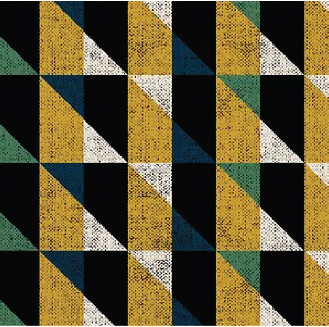
Unfavorable Pattern choice
This geometric pattern feels quite bold and vibrant, which can make it tricky to style. The strong colors and sharp shapes tend to compete for attention, and it’s harder to pair with other pieces without things clashing. For a more timeless and cohesive look, it’s best to stick with softer, more classic patterns.